-


Follow Us

x
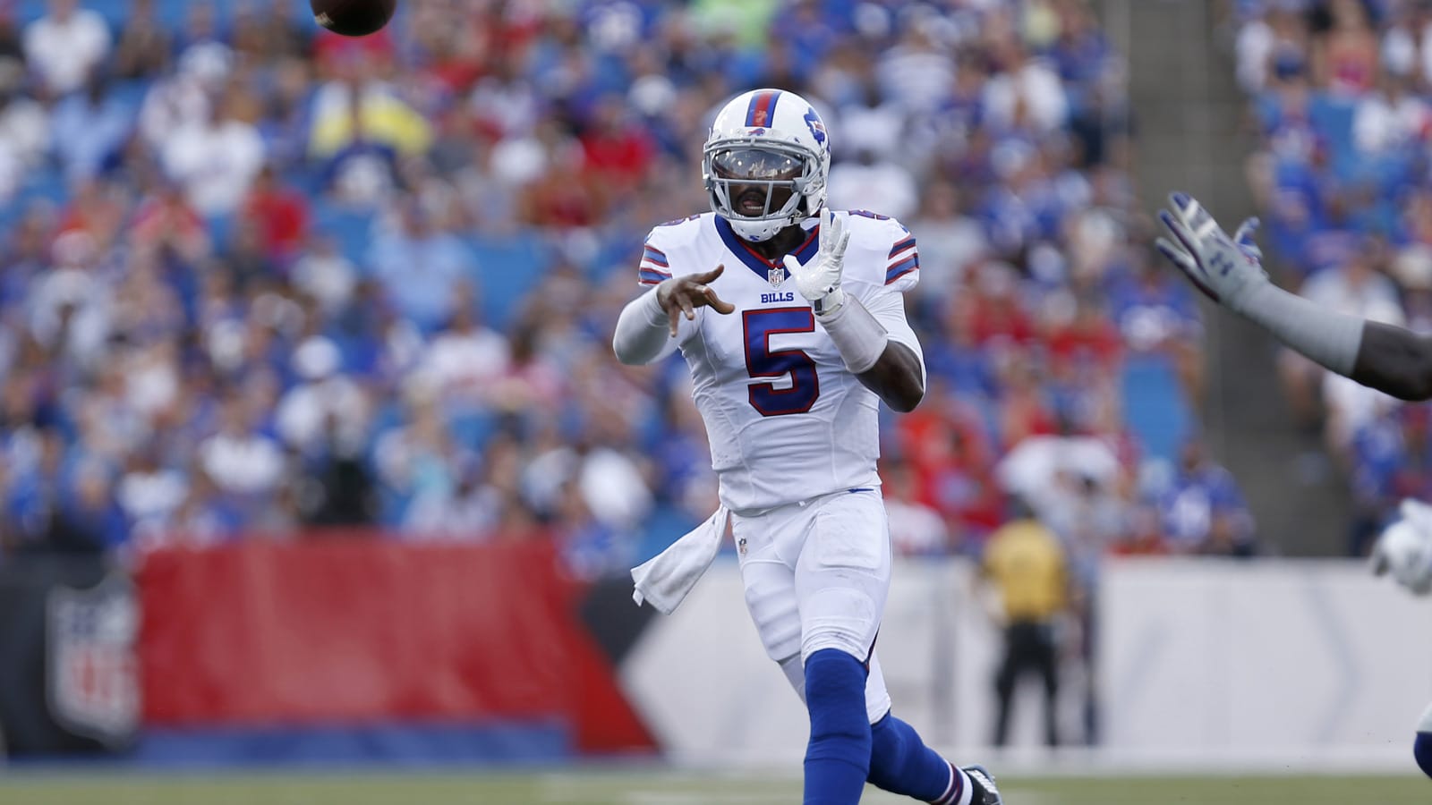
The Buffalo Bills have a clean jersey look.
USA TODAY Sports
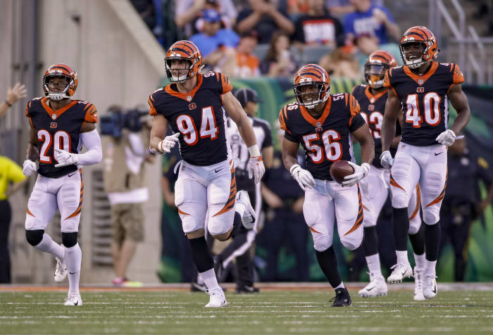
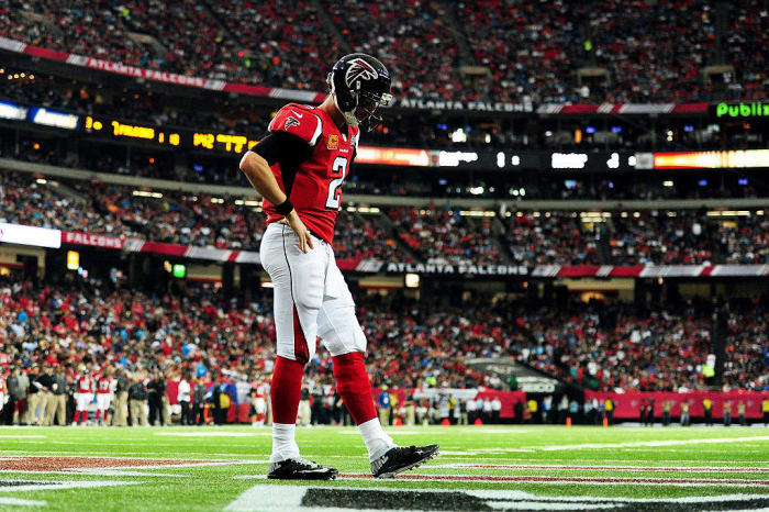
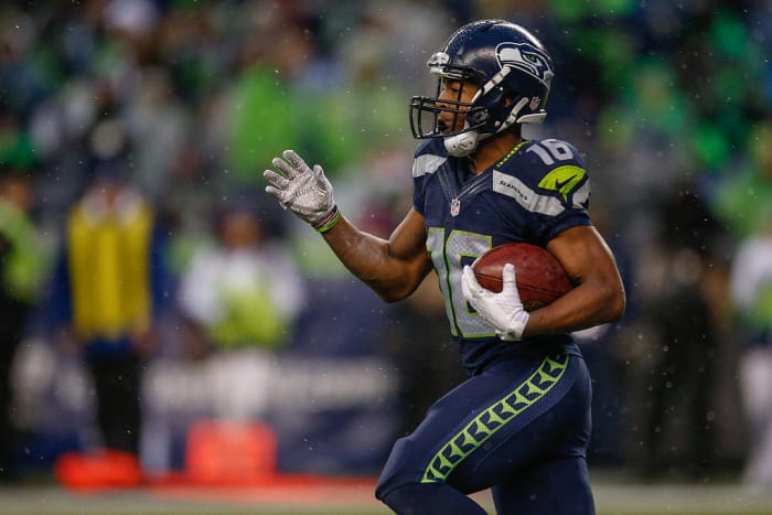
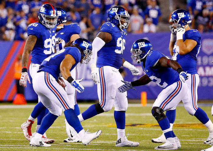
Ranking the uniforms of the NFL from worst to best


Breaking News
Customize Your Newsletter
 +
+
Get the latest news and rumors, customized to your favorite sports and teams. Emailed daily. Always free!
This site is protected by reCAPTCHA and the Google Privacy Policy and Terms of Service apply.